Thursday, August 26, 2010

Multiple Me

Today we took multiple pictures of ourselves using the Cannon cameras on a tripod. Then using Photoshop and layers to overlay the differing images of ourselves into one picture. Here are my results!

This picture came out quite bright as there was a window behind as well as the light in the library, but I like the way the different poses worked really well.

I really like the lighting in this picture, which was taken in one of the university toilets. I would have liked to use more poses, but the ones we got we too close together. The tripod also got sightly knocked which resulted in a misaligned picture.

Photography

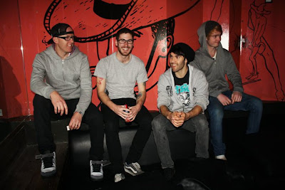
Last weekend i decided to further practice my photography skills, as my boyfriend's band had 2 gigs, so I took live band shots at The Bayside bar in Frankston and The Espy in St Kilda. It was tricky to get the the settings right for the lighting in the room as when each band went on stage it changed slightly with the lighting effect colours. I prefer the look of live band photos without using flash as I think it captures more energy and atmosphere of the performance, however with the movement and lighting of the band it is hard to get a clear and close up picture.
More pictures
I took most of them on TV mode and played around with the time value to suit the picture.

The Ascension

Dementia 13

Dementia 13

I also took some band shots whilst at the Espy....

Thursday, August 19, 2010

Inspiration continued...


I discovered August Bradley at the start of this year and I really love his photographs. His photos are often used in fashion, magazines and art galleries. I like the way his photos almost tell a dream-like story to the viewer and create a sense of mystery. The whole scene, composition, colour and costume seem to have been strategically thought out. His photos almost create a sense of stillness and he edits them to make his subjects look doll-like and frozen. From what I can gather I think he dramatises the way the light is falling on the subject which really gives the picture a 3D effect.


Diane Arbus is an American photographer (1923-1971) who was known for taking pictures of people who were not considered the 'norm' in society. I love the strange and haunting quality her pictures capture. I am interested in photographing people who look different to what is considered mainstream and appear unique or different to the majority of society (tattoos, piercings, abnormalities,strange attributes). I am thinking this could be an idea to further think about for my folio.

Monday, August 16, 2010

Experimentation

On the weekend I went to Frankston whilst my boyfriend was recording some acoustic songs. I decided to take a few snaps of him as I wanted to play around with the camera settings to try to get the right lighting and I also wanted to capture a portrait of his expression while singing.


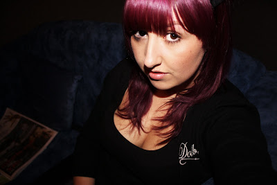
I was being vain and took a self portrait of myself. I like the intimacy and detail of portrait pictures when they are more closely zoomed in and you can see detail in the persons face.

Sunday, August 15, 2010

Brainstorming

I found a photographer who takes portrait pictures of people with tattoos. I like the way his photos really pop and I think it's due to the way he use photoshop.
Fab 5

Brainstorm for folio: (Just thinking about what I want my folio to be inspired by...)
Expression
Typology - hands, body parts, people, faces...
Portraits
Surreal
People in contrasting environments
Self portraits - a picture I like by sean marclee


Inspiration

After looking through some photography books at the library today, I came across some works which i found really interesting. First was French photographer and neurologist, Guillaume-Benjamin Duchenne de Boulogne's (1806-1875) images. They are portrait style, scientific-based photographs that were taken and used to study physiognomy. He conducted electrical experiments on patients facial muscles at the Salpetriere, a mental hospital in France, with a strong interest in expression. Although these images are quite confronting and disturbing to look at, the expression captured and surreal quality of the pictures is appealing to me.


Aruhi Arutokoro (1958) - I found this image in The Photobook: A History volume 1 (Martin Parr and Gerry Badger) I couldn't find it anywhere on the net so I took a pic with my iphone. I like the way the multiple images of womens legs have been photographed and lined up alongside one another to create a typology of legs. I am thinking of using typology as a theme for my final folio as well as photographing people. Although the poses are different the photograph has been taken from a similar distance and is focused on bodies from the waist down. I think the varied poses make the picture more interesting and perhaps tell a story about each of the people in the photographs. I like the way this image has captured a similarites in theme but also the differences of each person.


I also came across some work of Bill Brandt and was really intrigued and drawn in by his photographs. The perspectives he creates in his photos is so interesting and surreal. I like the way he often uses a particular aspect of the human body and works the photos composition around that. I am considering researching Bill Brandt for my presentation.


I like the use of the mirror and the reflection in this picture. When first looking at this image it gave me the illusion that it was a photo of a woman with two heads.

Thursday, August 12, 2010

Footscray Adventure

Whilst meeting at Footscray today, the weather wasn't looking too good - rainy and grey, however it did stop raining throughout the morning which made it a bit less hazourdess to get around with an expensive camera (although I also had a slight fear of getting mugged). After looking at the brief I decided to work on Excercise 3- based on the 8 colours of crayons first created in 1903. Footscray is quite a busy and very multicultural suburb filled with all sorts of people and predominatley asian, indian and african culture and food. It also has quite alot of grafitti, damaged shop fronts and laneways which can be quite busy to look at, so when there is something quite colorful it does tend to pop out of the grey and busy surroundings.
I have uploaded a few of the pics from todays shoot, the rest are at the link below.
http://www.facebook.com/album.php?aid=483079&id=619550084&l=0a52e629ee


A couple of shots of perspective down a laneway.

Thursday, August 5, 2010

Digital Fine Art Photography - Week 1

Digital Fine Art Photography - 'Ugly'
Today was my first photography class... my study background is in music and I am also undertaking art subjects this year eventually to become a teacher. I experimented with an artistic style of photography in my Digital Arts class last semester and I am looking forward to learning more and developing as a photographer. After being asked to try to capture an image of ugliness today, I found it was quite a difficult task. I tried to take close up images of things which I found to be perhaps not perfect, neat or desirable things that were existing quietly around Vic Uni. Below are some of the images I took and played with in Photoshop.


Web and Bark


Shadowed Web


Spit on ground


Spit on ground - close up


Wall with Rust


Wall with Rust - Colour Negative processed in Photoshop


Weathered Brick